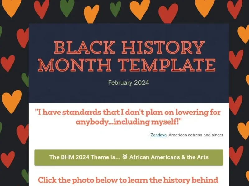
Learning from Mistakes: 5 Lessons from School Newsletters That Didn’t Get Clicks

☕ Busy? Want the TLDR? Here ya go!
1. Don’t write long blocks of text.
2. Say goodbye to long lists
3. Beware of making people scroll
4. Always. Use. Images.
5. Never bury the lede
(disclaimer: names and identities have been changed to protect the innocent)
You’ve got important information to share. You need people to read your school newsletters! If you’re not seeing the clicks or engagement you want, it may be because you’re making one of the following 5 mistakes:
1. DON’T: write long blocks of text.
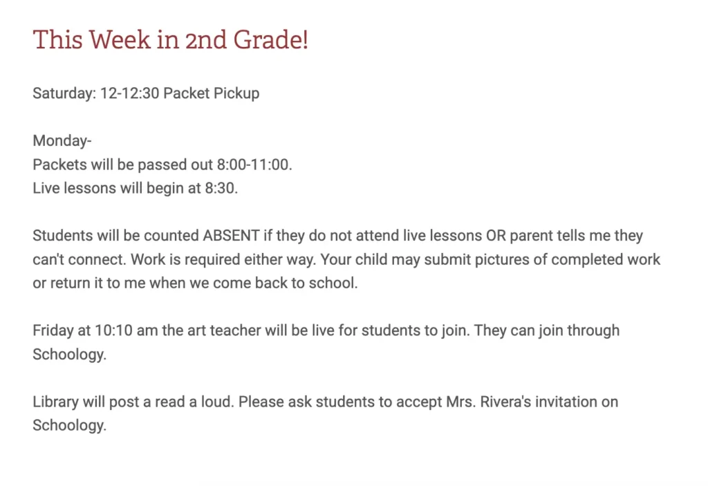
DO: Think visual
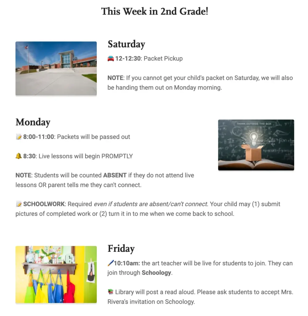
If you have a lot of info to convey, separate the instructions under headings, and organize them in a zig-zag pattern. It makes for a clearer path for your reader. It might take you a few more minutes to create, but it’ll save time in the long run when more parents follow your directions.
2. DON’T: write long lists of instructions with no guideposts.
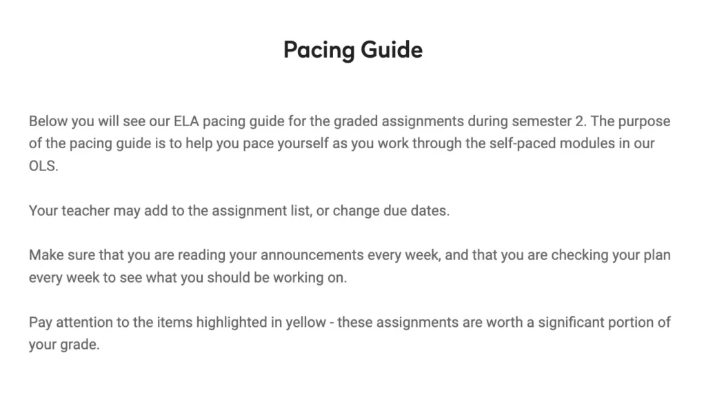
DO: use the tools you’re given.
Bullet points, bolded words, and numbered lists help your readers organize information in their minds.
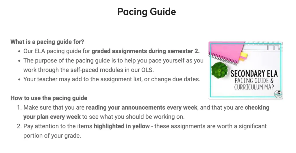
3. DON’T: create updates so long you have to scroll for days.

DO: Keep your scroll time to a minimum.
Aim to keep your newsletter to three or four essential sections. Remember: most people will read the update on their phone.
4. DON’T: create a newsletter without any images.
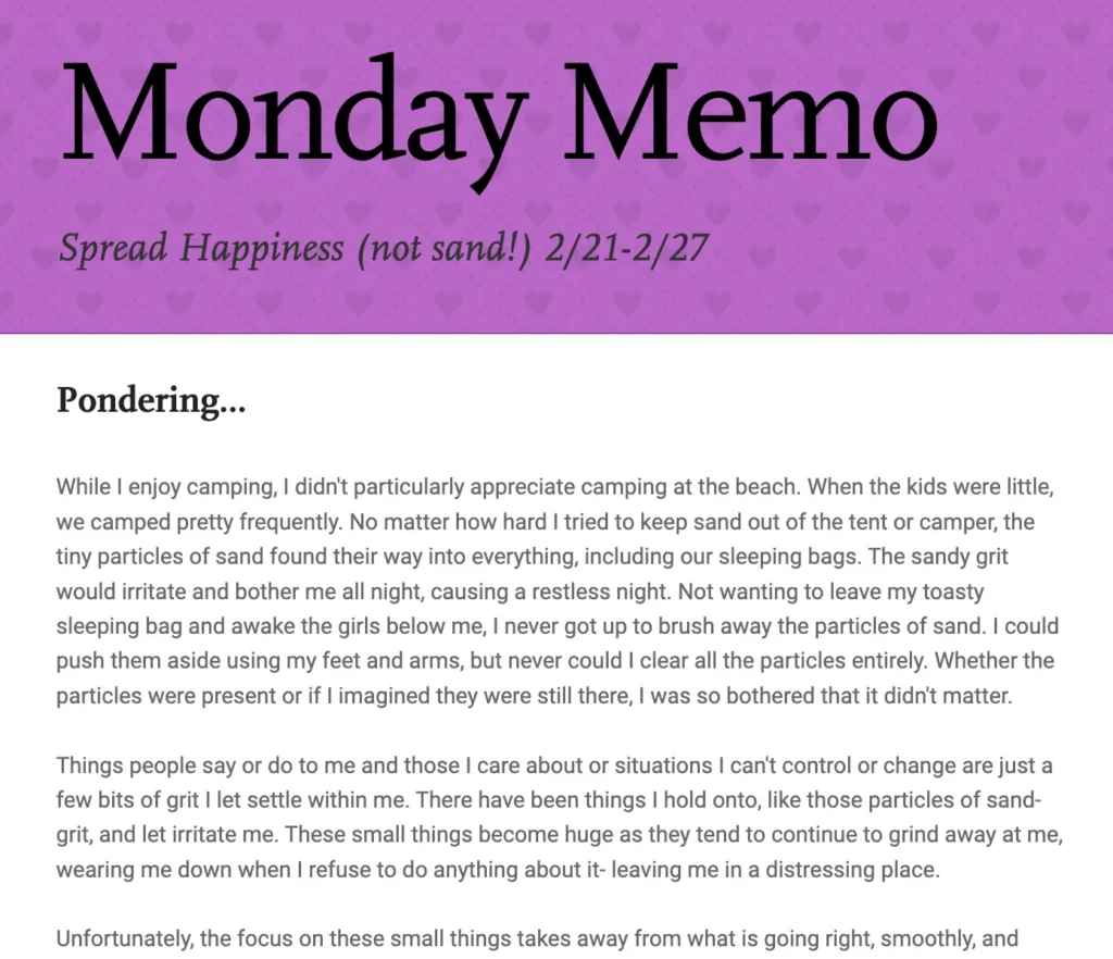
DO: remember that a picture is worth at least a thousand words.
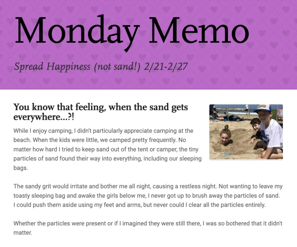
5. DON’T: Bury the lede. We are a nation of skimmers.

DO: write the important info in prominent section of a button, not in the small text.

See the difference? Smartphones and social media have conditioned us to expect The Headlines! in 280 characters (including spaces) and emojis. Don’t fight it! Create newsletters that meet people where they are. Get the results you want.
Need a pre-formatted template for a weekly update? You can find one here.
Subscribe to Smore Blog
Get the latest posts delivered right to your inbox


